Popular articles
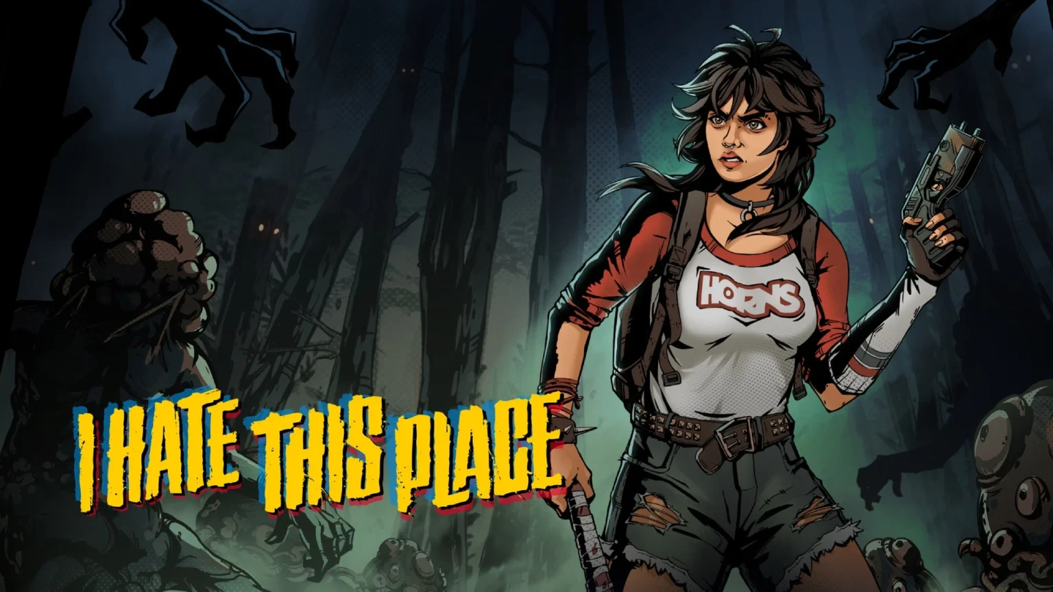
I Hate This Place Launches on Xbox with 80S Comic Flair
Table of Content

The isometric survival horror I Hate This Place is now available on Xbox Series X|S, arriving with a visual identity rooted in the award-nominated comic by Kyle Starks and Artyom Topilin. The team positions the game as a standalone story set in the same universe, avoiding a one-to-one replica while keeping the world’s tone intact. The project leans into 1980s comic-book aesthetics and turns graphic-novel language into interactive systems. The result is a horror experience where you don’t just hear information – you read it on screen.
Set in the Comic’s Universe, Not a Retread
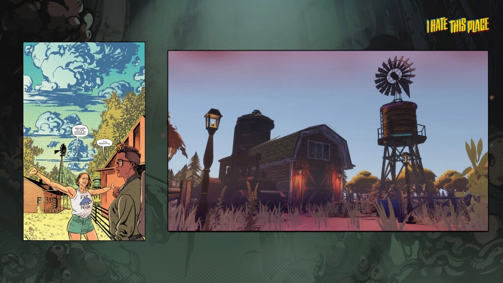
The developers emphasize that the game shares its world with the original “I Hate This Place” comics while telling its own story. They preserved the series’ proportions, realism-leaning vibe, and setting to stay faithful to the source. At the same time, they deviated in areas like shading, line thickness, and a broader color palette to give the game its own personality.
This balance aims to keep long-time readers oriented without simply mimicking the printed panels. It’s a familiar world expressed through systems and readability that fit an interactive medium.
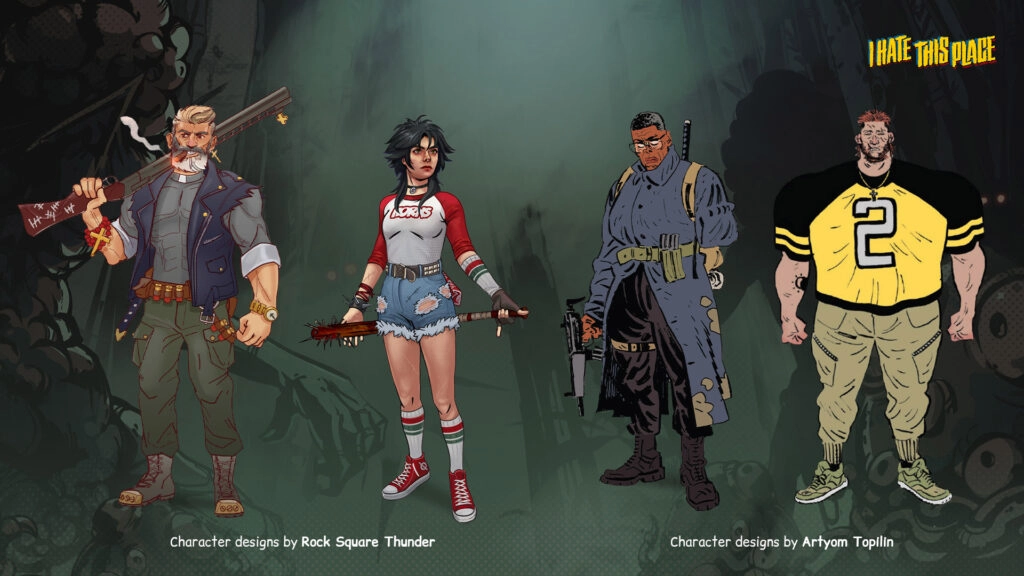
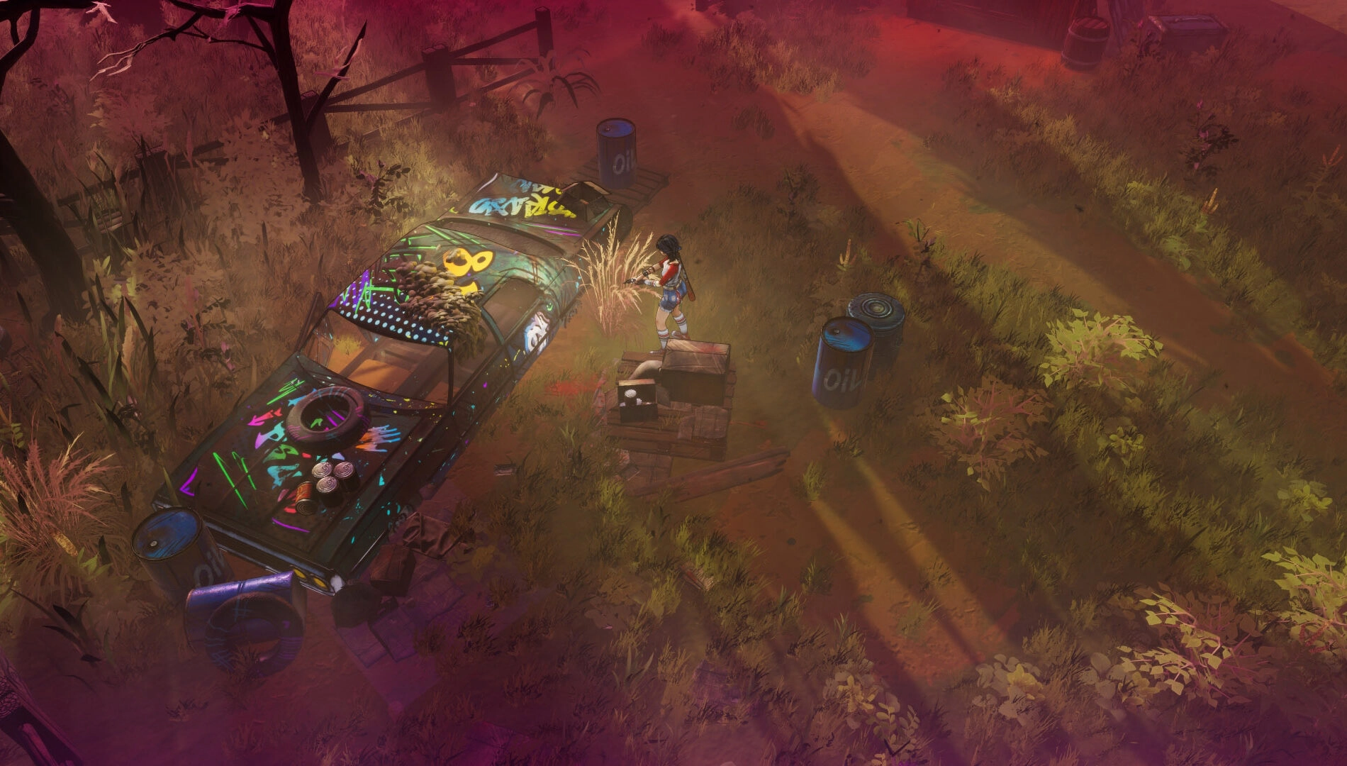
1980S Aesthetic – Loud, Saturated, Deliberate
The visual direction embraces an unapologetically bold comic style that aligns with the series’ 1980s setting. Expect thick black outlines, high-contrast scenes, and punchy saturation throughout environments and effects. Shadows are deep by design, highlights are intentionally sharp, and the presentation includes VHS-style static to amplify the era’s texture.
It’s not a muted or naturalistic take on horror; it’s a graphic, stylized approach that uses color and contrast to guide attention and tension.
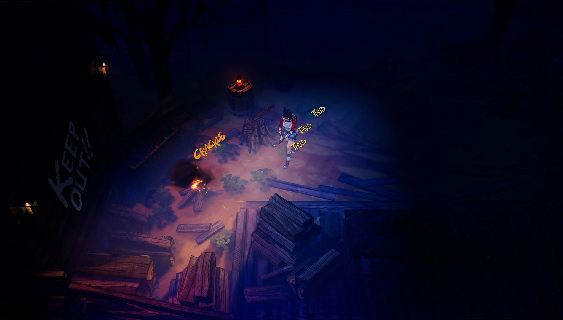
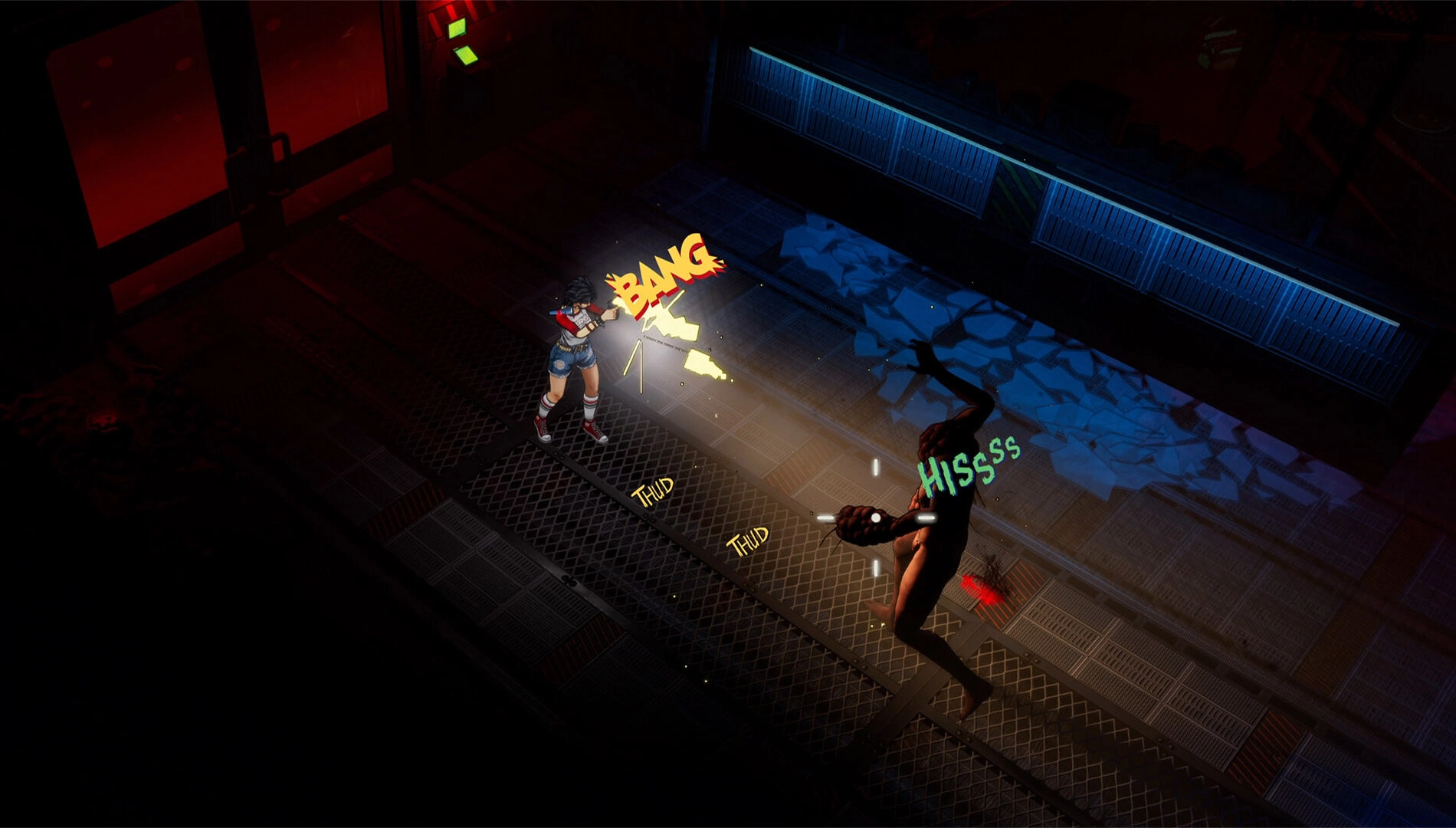
“Sound You Can See” – a Readable Stealth and Threat System
One of the game’s most distinctive ideas is visualized audio: in-world, comic-like callouts render sound as readable cues. Footsteps appear on screen as stylized effects that indicate how much noise you are making – critical because many monsters hunt by sound as much as by sight.
- Green footsteps – quiet movement when crouched or moving slowly
- Yellow footsteps – normal walking with moderate noise
- Red footsteps – loud running that can draw nearby threats
Read also our article: My Hero Academia: All’s Justice Locks Date and Shows Full Roster
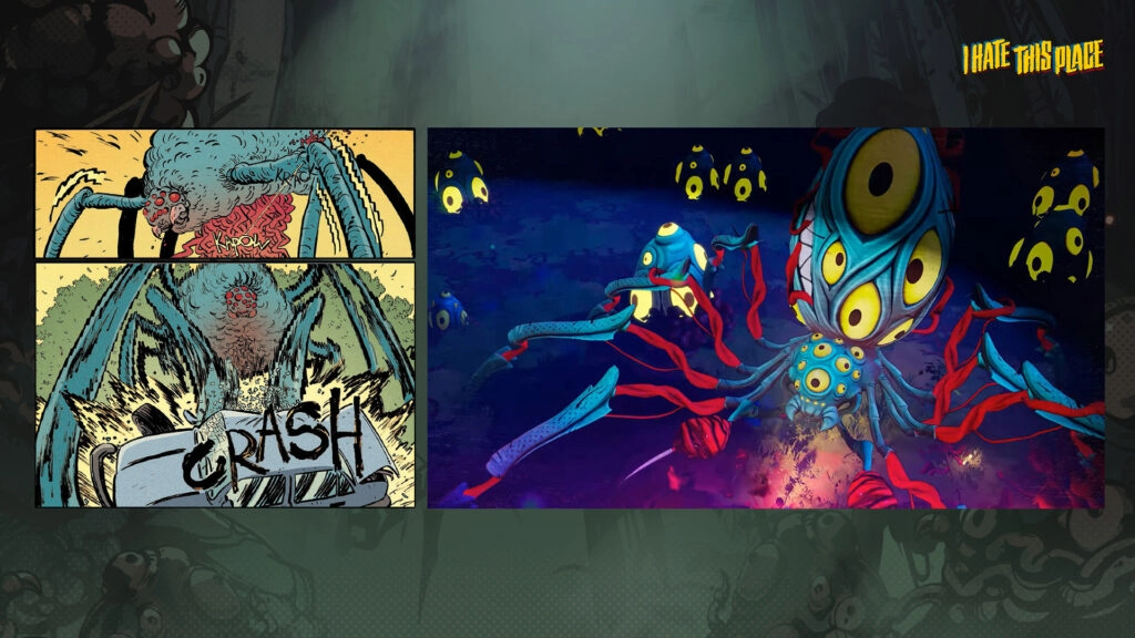
Weapons follow the same logic: guns don’t just crack; they rattle across the screen with bold callouts. Creatures telegraph their presence with jagged, unsettling visual “screech” markers, turning encounters into readable beats that echo how panels communicate action in comics.
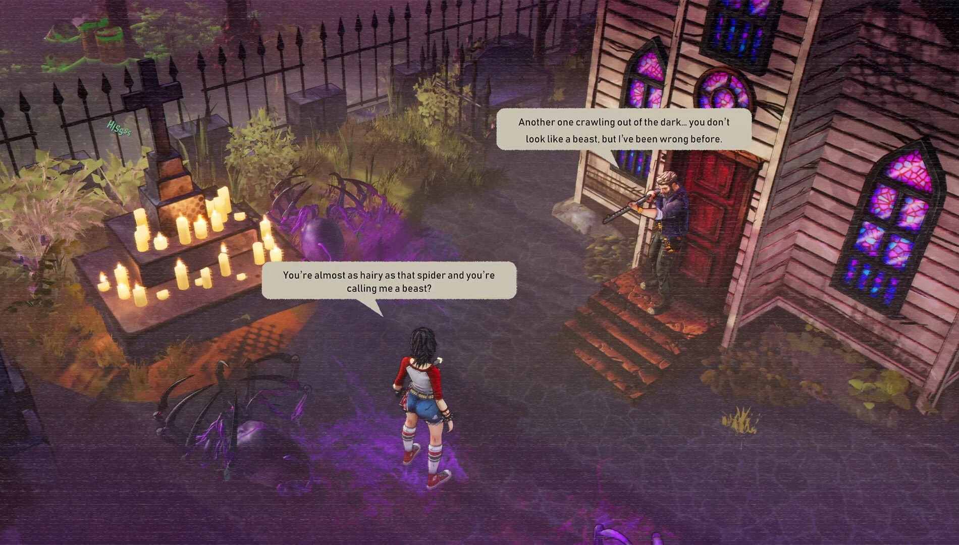
Dialogue in Bubbles, Not Subtitles
Conversations appear in speech bubbles above characters rather than as traditional bottom-of-screen subtitles. This choice keeps interactions inside the scene, reinforcing the feeling that players are navigating a living graphic novel rather than watching a separate interface element.
The aim is clarity and immersion – dialogue framing that supports the world’s comic grammar without breaking flow or tone.
Platform and Availability
I Hate This Place is available now on Xbox Series X|S. The release aligns the comic’s visual language with game mechanics, from bold linework to on-screen sound and bubble-based dialogue, to make the universe legible at a glance.
The team positions these choices as more than style – they are functional tools for reading danger, stealth, and intent in real time.
Final Takeaway – Why It Matters
By turning comics’ visual shorthand into systems, I Hate This Place offers a horror experience that’s both readable and nerve-wracking. For players, that means clearer stealth feedback, punchier combat cues, and a unified 1980s aesthetic that serves gameplay as much as style.
Category
Share the news
Meet the Author

Article:
Read all
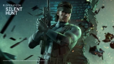
Solid Snake joins Rainbow Six Siege on March 3 with intel‑driven tools and scavenging gameplay. A few weeks later, a limited‑time 4v4 infiltration mode arrives alongside map and balance updates.
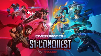
Season 1 opens the first chapter with Domina, Emre, Mizuki, Anran, and Jetpack Cat, plus the Conquest meta race between Overwatch and Talon. The world will update in real time as the story unfolds.
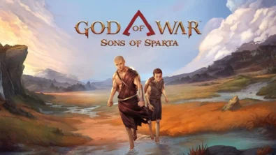
Kratos’ Spartan youth becomes playable in God of War Sons of Sparta – a canon, pixel‑art 2D prequel on PS5 with customizable spear‑and‑shield combat, Gifts of Olympus, and returning voice talent.
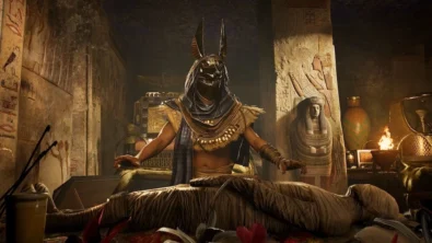
Ancient embalming, step by step – a new museum installation built on Assassin’s Creed Origins’ Discovery Tour lets visitors explore mummification interactively at Musée de l’Homme, open November 2025-May 2026.
Read also
Solid Snake joins Rainbow Six Siege on March 3 with intel‑driven tools and scavenging gameplay. A few weeks later, a limited‑time 4v4 infiltration mode arrives alongside map and balance updates.
Kratos’ Spartan youth becomes playable in God of War Sons of Sparta – a canon, pixel‑art 2D prequel on PS5 with customizable spear‑and‑shield combat, Gifts of Olympus, and returning voice talent.
Ancient embalming, step by step – a new museum installation built on Assassin’s Creed Origins’ Discovery Tour lets visitors explore mummification interactively at Musée de l’Homme, open November 2025-May 2026.
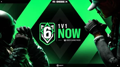
From training mode to centre stage: Rainbow Six Siege’s debut 1v1 circuit lands at the Six Invitational in Paris. Four regions, more than 3,200 entrants, semifinals Feb 14 and final Feb 15 for 5,000 US dollars.
Blizzard links its 2026 milestones with a cross‑franchise Showcase and confirms BlizzCon’s return later this year – with more announcements and “surprises” still queued, says president Johanna Faries.

High On Life 2 launches with day-one Game Pass Ultimate support, while Narrative Director Alec Robbins explains how the team crafts jokes with players—shaping character-driven, reactive comedy.
From a Star Trek survival-strategy take to stealth with Styx, eerie Backrooms horror, and management sims, Xbox’s February 17-20 slate packs 14 launches with Series X|S optimizations and cross-platform perks.
First full gameplay for CONTROL Resonant runs on PS5 Pro, spotlighting Dylan Faden in a reality-bending Manhattan with vast zones and Gravity Anomalies. Launch set for 2026 across console and PC ecosystems.
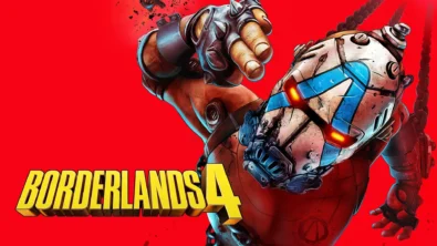
Borderlands 4 sets a co-op goal for this weekend: hit 500,000 successful teammate revives between February 12-15 to unlock a universal cosmetic skin. A minor update adds three Weekly Big Encore boss fights to raise the stakes.
A milestone collection bundles five classic Rayman versions, a first-ever playable SNES prototype, reimagined music, modern assist options, and over 50 minutes of developer interviews.
Співпраця
Співпраця - текст
TopGame Newsletter!
Unlock exclusive gaming deals, fresh guides, and insider picks — straight to your inbox. No spam, just real content for real players.